Many businesses struggle to understand why their traffic isn’t turning into profit. To fix this, you must prioritize high-impact landing page conversion strategies that focus on user psychology and data-driven design. In this guide, we will explore how to bridge the gap between a click and a confirmed sale, ensuring your brand builds trust and drives results in any competitive market.
Understanding the Role of Landing Pages in Sales
Getting someone to click your ad is only half the battle. What happens after the click determines whether you make a sale or lose a lead forever. A landing page is the critical bridge between a visitor’s curiosity and your conversion goal — and most businesses underestimate just how much weight that bridge has to carry.
Consider this: according to Apexure, many marketers drive significant traffic to post-click experiences that simply aren’t built to convert. The click brings them in; a poorly optimized page sends them away.
A landing page isn’t just a destination — it’s your silent salesperson, working 24/7. Getting the fundamentals right, from site speed to conversion design, is non-negotiable. So what actually makes one work? Let’s break down the key elements.
Key Elements of an Effective Landing Page
Every click that lands on your page represents a real person with a real intention. Converting that intention into action requires more than a pretty design — it demands a carefully engineered experience built around proven conversion principles.
A high-performing landing page typically combines four core elements:
- A compelling headline that immediately confirms the visitor is in the right place
- A clear value proposition that answers “what’s in it for me?” within seconds
- Social proof — testimonials, reviews, or trust badges that reduce hesitation
- A single, focused call-to-action that guides visitors toward one decision
In practice, pages that try to do too much end up accomplishing nothing. Simplicity wins. A well-structured page keeps visitors focused, reduces friction, and builds enough trust to push them over the decision threshold.
Speed and functionality also play a critical role. A visually clean page built on a solid technical foundation loads fast, displays correctly on mobile, and never frustrates visitors before they’ve even read your offer.
“The most persuasive landing page isn’t the flashiest — it’s the one that makes the right visitor feel completely understood.”
Knowing what should be on your page is just the start. Understanding what commonly goes wrong is where most businesses find their biggest opportunities for improvement.
Common Mistakes That Hurt Landing Page Performance
Even well-designed pages can quietly sabotage sales if they fall into predictable traps. Knowing what these mistakes look like is the first step toward fixing them.
A few of the most damaging patterns include:
- Too many calls-to-action — When visitors face multiple competing options, decision paralysis sets in and they leave without acting
- Slow load times — Even a one-second delay can erode conversions significantly
- Mismatched messaging — When your ad promises one thing and your page delivers another, trust evaporates instantly
- Cluttered design — Excessive visuals, dense copy, and competing elements overwhelm visitors before they can engage
As this landing page breakdown highlights, a confused visitor never converts.
Every element on your page is either earning trust or destroying it — there’s rarely a neutral middle ground.
Once you recognize these common patterns, the logical next step is evaluating whether your own page is making these mistakes right now.
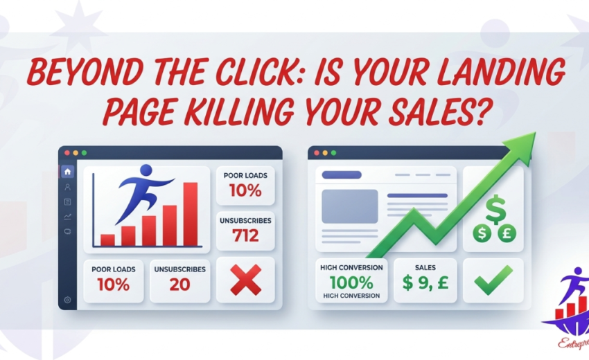
Analyzing Your Landing Page: Is It Killing Your Sales?
Recognizing the warning signs early is what separates pages that quietly drain ad budgets from those that consistently deliver results. Landing page optimization isn’t a one-time fix — it’s an ongoing diagnostic process that demands honest evaluation of what’s actually happening after the click.
Start by asking the hard questions. Is your bounce rate unusually high? Are visitors spending seconds — not minutes — on your page? Data doesn’t lie, and behavioral signals often reveal misalignments between what your ad promises and what your page delivers.
A landing page that confuses visitors costs more than one that converts them — because confusion compounds over every campaign dollar spent.
What typically happens is that page issues aren’t obvious at first glance. They hide in slow load times, mismatched messaging, or a CTA buried below the fold. Tools like heatmaps and session recordings can surface exactly where users abandon the journey. This analysis reinforces how diagnosing these friction points systematically leads to measurable improvements.
Understanding your page’s weaknesses sets the stage perfectly for applying targeted optimization strategies — which is exactly where to focus next.
Optimization Strategies for Better Conversion Rates
Once you’ve diagnosed what’s holding your page back, the real work begins — systematically improving every element that influences whether a visitor stays, trusts, and converts.
Conversion rate optimization isn’t about guessing. It’s about making intentional, evidence-backed changes that align with how visitors actually think and behave. A common pattern is that small, strategic adjustments — tightening a headline, repositioning a CTA, or reducing form fields — compound into measurable gains over time.
“The highest-performing landing pages treat every design decision as a hypothesis worth testing, not a preference worth defending.”
One practical approach is A/B testing single variables in isolation. Changing too many elements at once makes it impossible to identify what actually moved the needle. Start with your headline, since it carries disproportionate weight in shaping first impressions.
Social proof, urgency signals, and visual hierarchy also deserve regular attention — as this breakdown of smart landing page strategy illustrates, trust-building elements positioned near your CTA can meaningfully reduce friction at the critical decision moment.
Keep in mind, though, that no single tactic works universally — which is exactly what the next section addresses.
Limitations and Considerations
Even the most well-executed optimization strategy has boundaries worth acknowledging. Converting traffic to sales isn’t a formula you apply once and walk away from — it’s an ongoing process shaped by variables that no single tactic fully controls.
A common pattern is that businesses invest heavily in page improvements, only to see results plateau. That’s not failure; that’s the natural ceiling of isolated optimization. Landing page performance is always relative — relative to your audience, your offer, and the broader market conditions at any given moment.
A few important caveats to keep in mind:
- Testing takes time. Meaningful A/B test results often require weeks of consistent traffic.
- Industry benchmarks vary widely. What works in SaaS won’t automatically translate to e-commerce.
- No page exists in isolation. Ad quality, audience targeting, and post-conversion follow-up all influence the final outcome.
“Optimizing a landing page without considering the full customer journey is like fixing one leak while ignoring three others.”
If you still have questions about specific scenarios or best practices, the next section addresses the most common ones directly.
Frequently Asked Questions About Landing Pages
What exactly is the “post-click experience,” and why does it matter?
The post-click experience is everything a visitor encounters after clicking your ad or link — the page design, messaging, load speed, and call to action. It’s where conversions are won or lost. A compelling ad means nothing if the landing page doesn’t deliver on that promise.
How long should a landing page be?
It depends on your offer. Simple offers (free downloads, newsletter signups) typically perform well with short pages. Complex or high-ticket offers often benefit from longer, detail-rich pages that address objections thoroughly.
How many CTAs should a landing page have?
One primary goal, one primary CTA. Multiple competing actions create decision fatigue and reduce conversions.
How often should I test my landing page?
Continuously. Treat optimization as an ongoing process, not a one-time fix. The patterns you uncover through consistent testing are ultimately what the next section’s key takeaways are built around.
Key Takeaways
Every concept covered in this article points toward one central truth: getting clicks is only half the battle. What happens after the click determines whether your marketing investment pays off.
Here’s a quick summary of what separates high-converting landing pages from costly ones:
- Message match between your ad and landing page builds immediate trust
- A single, clear call-to-action removes decision fatigue
- Page load speed directly impacts bounce rates — even a one-second delay can erode conversions meaningfully
- Social proof, trust signals, and visual hierarchy guide visitors toward action
- Continuous A/B testing compounds improvements over time
“A landing page isn’t a destination — it’s a conversion system where psychology, design, and data work together.”
In practice, the most effective pages share one quality: ruthless clarity. They remove friction at every step. That said, even well-optimized pages can underperform when deeper website issues exist — which raises an important question worth exploring next.
Why Am I Not Getting Sales on My Website?
If traffic is flowing but revenue isn’t following, the answer to why your landing page kills sales is often hiding in plain sight. It’s rarely about a single catastrophic mistake — it’s usually a pattern of small friction points that compound into a conversion-crushing experience.
A common pattern is misalignment between what drew visitors in and what they find on arrival. When the promise made in an ad doesn’t match the page’s headline, message, or offer, visitors feel deceived — even subconsciously — and leave.
Other frequent culprits include:
- Unclear value propositions that leave visitors guessing
- Slow load times that erode patience before the page even renders
- Weak or buried CTAs that don’t guide the next step
Understanding where visitors drop off is the first step toward fixing it. That naturally raises the question: what specific design and copy decisions actively push buyers away?
What Makes a Bad Landing Page?
Understanding what makes a bad landing page is the fastest shortcut to fixing one. While previous sections explored specific failure points — slow load times, weak CTAs, trust gaps — it helps to see the full picture in one place.
A bad landing page typically shares these traits:
- Mismatched messaging between the ad and the page itself
- Cluttered design that overwhelms visitors with too many choices
- Vague value propositions that leave users wondering, “What’s in it for me?”
- No social proof to reassure hesitant buyers
- Weak or buried CTAs that don’t demand action
The core problem behind all of these? A disconnect between landing page views vs sales — traffic arrives, but nothing compels visitors to convert.
A landing page that looks good isn’t necessarily a page that works — beauty without strategic intent is just expensive decoration.
In practice, bad landing pages treat design as the destination rather than the vehicle. Stripping away confusion and focusing every element on a single conversion goal is what separates high-performing pages from digital dead ends — a distinction the next section explores in even sharper detail.
Read More: Stop Boosting: Why Your Facebook Ads Manager Drives Real Sales?
What’s the Real Difference Between Landing Page Views and Sales?
Understanding the gap between traffic and sales is arguably the most clarifying shift a business owner can make. Views are vanity; conversions are reality.
A landing page view simply means someone arrived. A sale means every element — the message, the design, the offer, the trust signals — worked together to move that person to act. Those are fundamentally different outcomes requiring fundamentally different thinking.
What typically happens is that marketers celebrate rising traffic numbers while ignoring a stagnant conversion rate. A page getting 5,000 monthly views but converting at 0.5% is underperforming compared to one getting 1,000 views at 4%.
Traffic without conversion strategy is just an expensive audience that never buys.
The practical fix? Stop optimizing for clicks. Start optimizing for decisions. That distinction becomes especially critical when paid advertising enters the picture — which leads to a painful question many advertisers face.
Spent $320 on Google Ads, 0 Conversions. Why?
This scenario plays out every day: a business owner launches a Google Ads campaign, watches the clicks roll in, checks the budget — and finds zero sales. The traffic showed up. The money left. So what went wrong?
The answer is almost never the ad itself. The ad’s job is to earn the click. The landing page’s job is to turn clicks into sales. When that second step fails, every dollar spent on traffic becomes a sunk cost.
A common pattern is a fundamental mismatch between what the ad promises and what the page delivers. Visitors arrive with a specific expectation. If the headline, offer, or tone doesn’t immediately match that expectation, they leave — often within seconds.
Key culprits in zero-conversion campaigns typically include:
- Message mismatch between ad copy and landing page headline
- No single, clear call-to-action — the page tries to do too much
- Generic landing pages shared across multiple campaigns
- Trust gaps — missing reviews, guarantees, or credibility signals
What’s worth noting here is that ad spend only amplifies what’s already working — or broken. Pouring more budget into a broken funnel doesn’t fix it. It accelerates the loss.
Fixing the page before scaling the spend is the smarter sequence. And that fix often starts much earlier than the landing page itself — at the level of how your broader web presence is structured and optimized. Which naturally raises a question that trips up even experienced marketers: are SEO mistakes quietly undermining your visibility before visitors ever reach your page?
The Final Word: Turn Clicks Into Customers
Every insight covered in this article points to one undeniable truth: traffic without conversion strategy is just an expensive distraction. The gap between a landing page view and a completed sale isn’t accidental — it’s built from accumulated mistakes, from mismatched messaging and slow load times to weak calls-to-action and misaligned ad intent.
Here are the core takeaways to carry forward:
- Views measure attention; sales measure trust — optimize for the latter
- A single, focused CTA consistently outperforms cluttered pages
- Ad spend without a conversion-ready landing page is money lost
- User psychology and data-driven design must work together
In practice, the businesses that win aren’t always running the biggest budgets. They’re running the smartest pages.
“Your landing page isn’t just a destination — it’s the make-or-break moment where curiosity either becomes a customer or clicks away forever.”
Start with one fix. Test it. Then build from there. Beyond the click, every element of your landing page either earns the sale or quietly kills it — and now you know exactly where to look.
April 2, 2026
Stop Boosting in 2026: Why Your Facebook Ads...

April 2, 2026